First, John needs a Budget
A joke that showed some promise.
Name based off of the popular budgeting app You need a Budget, or YNAB
My friend John is developing a website to help people understand their spending habits through the use of intentional, monthly budgets. One night, we were discussing a recurrent UI / UX problem he was facing in the web app. He wanted to display multiple different reports next to each other; making it easier for users to understand their spending habits. We joked that what we needed was a full OS-like windowing system.
I couldn't get the idea out of my head. I thought, not only should it have a window manager, but it should look right at home on a classic Mac. My first point of reference was the online Mac Plus emulator, running System 7. Looking through the VM, the design seemed feasible. I had no choice but to make a prototype.
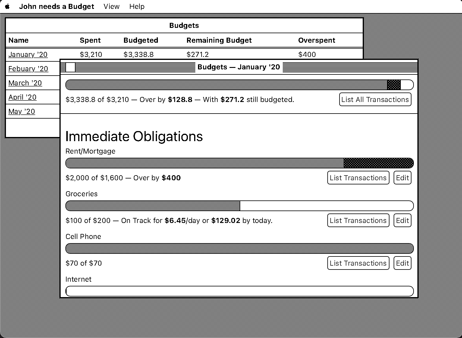 A prototype of my proposed design; each month can be opened in a window.
Over the course of the next day, I wrote a design-only prototype. The site pretended to be an app called “John needs a Budget”, which allowed users to track their purchases in monthly budgets. Most of my time was spent on making the graphical list of budgets, using a progress bar to show how much of a budget has been spent. To get that Classic Mac look, I made a Menu bar, active/inactive window chrome, a tightly checkered background, and replicated the black-and-white colorspace of the original.
It worked! But, it wasn't perfect. The progress-bar could be hard to parse. For example, we can imagine two budgets. Budget A, a $20 budget with $100 of overspending. And, Budget B, a $2,000 budget with $1,000 of overspending. Which is worse?
- Budget A: $100 or 500% over-budget
- Budget B: $1,000 or 50% over-budget
Since we changed our presentation mode to adjust for the overspending, we made it hard to parse just how bad the spending really was. In the above example, Budget A looks worse than Budget B, even though it's a magnitude less overspending. This style of presentation could be useful if we were trying to evaluate the correctness of our budgets. But, our task here is to show people where their money is going. So, it's not useful to have the physical size of a dollar change so drastically. The prototype showed that the proposed design was flawed, but the windowing system was a good fit.
The goal for this version was to create an interactive windowing system, and to make a few apps to show the concept. I decided to really lean into the System 7 feel by trying to capture the design patterns of the era, while keeping modern functionality. For example, the classic Macs, like the ones that ran System 7, had a resolution of only 512x342 pixels. That's tiny! I decided to allow any screen size, and give my apps extra breathing room.
I started by creating a control panel, that like System 7, was file/folder based (though there was not a real file system here). Using CSS rules, it allowed for changing the brightness and tint of the site, with the default being a warmer look.
 System 7's display control panel, capable of "dimming" the screen, adding a sepia tint, and inverting the colors.
Next, I started on designing a budgeting app based on my pet-project: Forcastula. The idea behind Forcastula is that it would use past transactions to predict future ones. So this app would need a way to view past transactions and future transactions; and I wanted at least one graph help the user see their funds overtime.
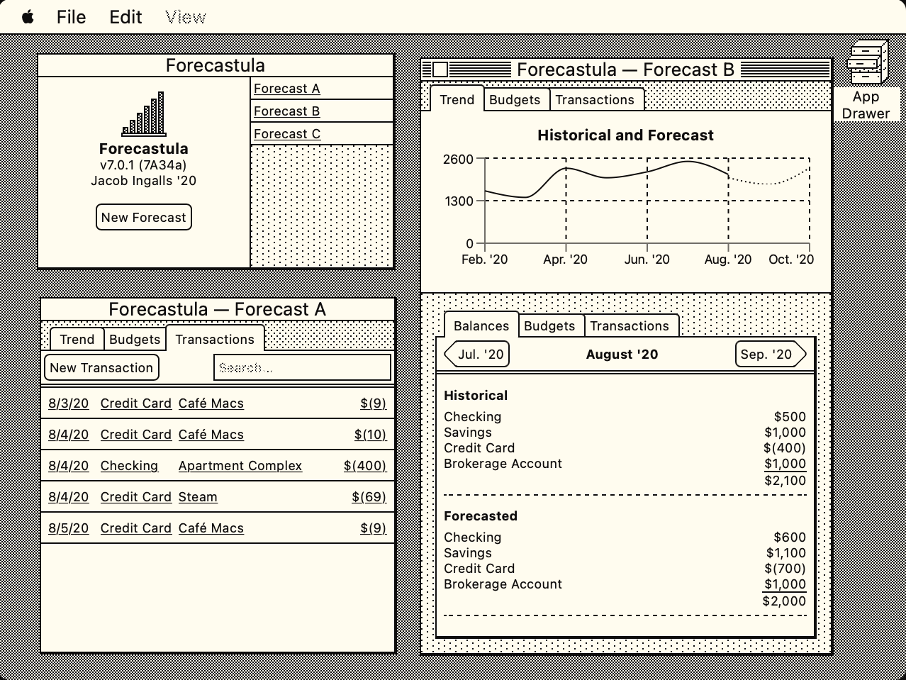 The Forecastla App.
Top-Left: The Welcome Window with recently opened forecasts.
Bottom-Left: A forecast open to the list of entered transactions.
Right side: A forecast open to the trend tab, showing forecasts.
Overall Implementation was straight forward. I chose to arrange the app around a top tab bar. It divides the functions of the app into three main roles: Looking at trends, configuring budgets, and viewing transactions. The first one is the most important to me, as it is where the forecasting comes in.
I prefer looking at my forecasts as a graph as I can quickly read if things look good. E.g. does the forecast look like the actual? is the graph going up or down over time? However, just seeing a line isn't enough; you also have to be able to drill in and see the details. For this I added a second tabbed area under the graph that lets the user see what happened in a given month, and what is forecasted. This allows the user to see exactly what the discrepancy is, and correct it. For example, they underestimated how many times they go out to eat sushi.
I am really happy with the design I arrived at. I think it looks right at home on the system, enough though a real Mac would't have a tall enough screen for it. It was a blast trying to think within the constraints of the system, and implement it within the constraints of the web. If you haven't already, please check it out!
System 1
An interactive demonstration of how different colors work in a two color interface.
Later, I wanted to see how a more modern web app would work using only two colors. I created a very simple test website with some common tropes, like a header, callout, and modal. And at the bottom are controls that change what the two colors are.
 A comparison of a custom pallet in System 1.
Color pallet set to #8BD3B2 and #000; and the inverse.
In my opinion, both look good and are easily readable.
My hope was to create a two color interface where the same two colors could act as light mode in one orientation, and dark mode in the other. I found a few color combinations that could work, though they tend to be very, very bright or lack sufficient contrast in one of the orientations.
What I've Learned
A binary colorspace has limitless advantages:
- It's easy to pick a color.
And it comes with some disadvantages:
- Dithering and patterns are not a proper replacement for color, as they do not work in many situations (e.g lines or fonts). Finding a good pair of patterns can be a challenge. A good pair is quickly distinguishable, implies the correct relationships between elements, and are visually pleasing next to each other.
- Moiré Patterns form easily when scrolling, moving the window, scaling, or even using non-pixel aligned resolutions on monitors (The default for many Retina MacBooks.) These are often more than distracting, as they can blink and animate, making it harder to see the boundaries between elements.
- It is much harder to create a sense of depth. Opacity is often used to make one layer seem above another. We can do that with dithering, but it tends not to work well. Using a pattern (e.g. a checker pattern) to mask out the top layer, we can then expose some of the pixels below. However, as there are not many pixels in the text we can omit and retain legibility, text tends to be impossible to read. Or worse, the remaining top layer and bottom layer can combine to create an unpleasant pattern. Dithering over text must be completely avoided.